Editing Philosophy
Heather McHugh, poet and professor at the University of Washington, writes in What Will Suffice: Contemporary American Poets on the Art of Poetry, "One writes poems as one lives, with full attention to the partiality of things." In editing Dickinson's poem, I have taken McHugh's philosophy on the writing of poetry and applied it to the editing of poetry. Editing, by nature, assumes change from the original, and, with McHugh's words in mind, also assumes a sort of self-consciousness. As editor, I am aware of the partiality of what I am doing. Dickinson's text cannot travel through me unmarred by my own tastes, and, so, I view my job of editing as communicating the poem as I sense it, both visually and emotionally, and presenting it, changed as it must be from the form given by Dickinson's hand, in my own hand, or at least through my hands on the keyboard.
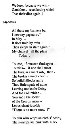
Notes on Editing
Page layout: I have centered the poem in an attempt to recreate the feel of the poem as "owning" the page. Dickinson's rendering of the poem scrawls across the length of the page, and, when typing the poem, I realized the starkness of the white space and the relative smallness of the poem, visually. Since the visual impact of Dickinson's broad gestures is so stunning in her manuscripts, I feel the need to provide at least the slightest hint of the poem as moving space rather than encroaching on it by coming in just on the left side of the page as is the norm in typesetting today.
Page Break: The first three lines of this poem begin on the bottom of the right side of the fascicle. The rest of the poem continues on the other side of the page. This spacing creates an interesting visual impact because the reader must turn the page to view the remainder of the poem which is spaced down enough on the page that Dickinson could have squeezed the first three lines on the same page. By indicating the page break and adding space in between, I hope to provide the reader with the opportunity to probe the implications of Dickinson's two page technique. In its first publication, in Todd and Bingham's Bolts of Melody, the poem is divided, by stanzas, into four different poems, and in Johnson's variorum, the first three lines are separated off as an individual poem. There has been, obviously, some question about the first three lines' relationship to the rest of the poem, and, by viewing the page break, the reader can also question, textually and visually, the impact of Dickinson's choice to spread the poem over two pages, and, further, whether the first three lines really do belong with the rest of the poem.
Dashes and Punctuation: I have placed the typeset rendering of the poem in my PageMaker program to experiment with the placement and length of dashes and other marks (including periods) Dickinson makes on the page. In this poem, the dashes tend to be rather short, and often spaced very close to the word they follow. By drawing in the dashes rather than standardizing them all as of equal length, I have provided the reader with a sense of the visual action in the poem. The movement of the dashes, up and down, wider and more narrow, tight and loose, adds another dimension of energy to the poem. Dickinson's dramatic use of the dash is accompanied by exclamation points and quotation marks which I have decided to standardize in the same way that I have standardized her handwriting. Drawing in the quotation marks, I think, places too much emphasis on them as compared to the rest of the typed words. Similarly, I have not drawn the dashes to emphasize their handwritten effects, but rather to indicate the differences in placement and length that cannot be accomplished with the standard dash. I have drawn in one element of punctuation that does not have an equivalent on our keyboard. In the penultimate line, I have reversed a comma to indicate Dickinson's handwritten symbol, most comparable to what we would recognize as a backwards comma. I don't feel that the traditional dash does justice to this mark, and, while the mark I have provided is not identical to the original, it is an attempt to show the reader the breadth of Dickinson's punctuation.
Spacing: I have spaced punctuation (dashes, exclamation marks, periods and other marks) as they are spaced by Dickinson in the fascicles for a reason similar to the one I apply to the drawn-in dashes. The spacing adds to the dynamic nature of the poem, and to leave out the space is to leave out the reader's opportunity for reading space as well as text. Also, I have provided space between stanzas where Dickinson provides space.
Lineation: I have typeset the poem following the exact lineation used by Dickinson. The one word "Today" is placed alone and indented by Dickinson, and I have done the same. While it could be argued that "Today" belongs on the previous line, I feel it is most important to show the reader the lineation as it appears in the fascicle, leaving it open for debate rather than making the decision to add it to the previous line myself.